A real estate website rarely fails loudly. It does not crash on a Monday and force you to act. It leaks. A buyer bounces because the site took six seconds to load on their phone. A seller cannot find your valuation form, so they fill out the one on a competitor’s cleaner site instead. You never see those lost leads, which is exactly why a weak site can cost a brokerage money for years without anyone flagging it.
The stakes are higher in real estate than in almost any other local business. The National Association of Realtors has found for years that nearly all buyers use the internet during their home search, and the property they eventually buy was very often first seen online. Your website is not a brochure that supports your “real” marketing. For most prospects it is the first showing, the first impression, and the first test of whether you look like someone they should trust with the largest transaction of their life.
Here are nine signs your real estate website design is working against you, and what a redesign should fix.
1. It is slow on a phone
Most property searches now happen on mobile, often from a couch while a listing is open in another tab. If your site takes more than about three seconds to load on a phone, a large share of visitors leave before they see a single listing. Heavy image sliders, bloated page builders, and unoptimized listing photos are the usual culprits. A redesign should compress and lazy load images, cut unused scripts, and target fast Core Web Vitals scores, because speed is both a ranking factor and a trust signal.
2. The IDX feels bolted on
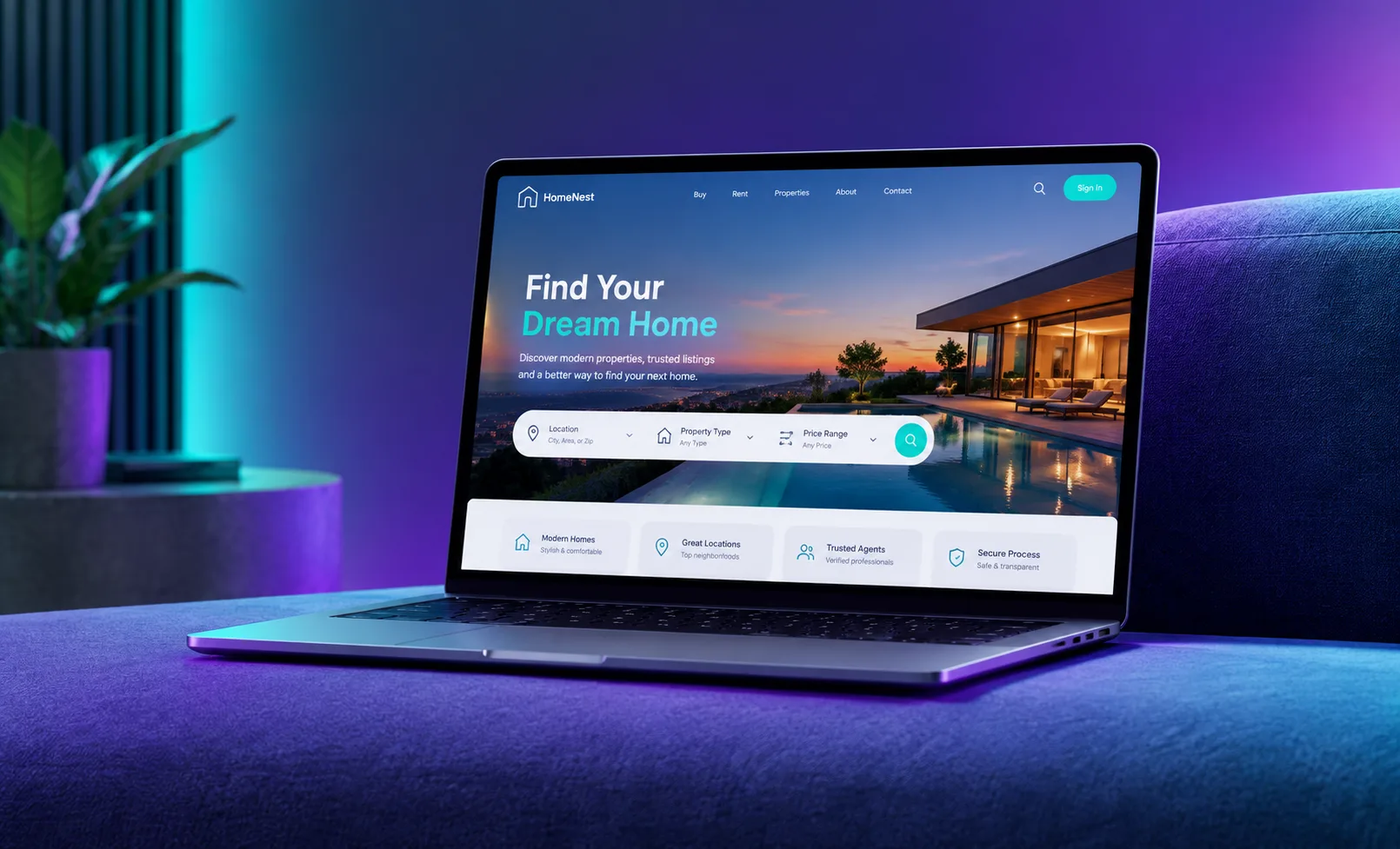
Direct answer: your IDX or MLS integration should feel like a native part of your site, with fast search, clean map results, and saved searches, not a clunky iframe that looks like a different website entirely. When the listings section jumps to an ugly third party layout, buyers feel the seam and trust drops. Good real estate web design wraps property search in your brand, keeps the experience consistent, and captures the lead inside your funnel rather than someone else’s platform.
3. There is no obvious next step
Walk your homepage as a stranger. Within five seconds, is it obvious what to do next? A strong site offers one or two clear actions, usually “search homes” for buyers and “what is my home worth” for sellers. Weak sites bury these under a hero video, a long bio, or ten menu items of equal weight. If a visitor has to hunt for the point, most will not bother.
4. Lead capture asks for too much, too soon
A form that demands full name, phone, email, budget, timeline, and preferred neighborhoods before showing anything is a form most people abandon. Match the ask to the moment. Let people browse, offer a low friction reason to give an email (a new listing alert, a neighborhood report), and save the deeper questions for later in the relationship. Shorter, smarter forms almost always lift lead generation volume.
5. It looks like it was built in 2014
Design ages in public. Small caps navigation, gradient buttons, stock photos of generic city skylines, and a cramped layout all signal that the business behind the site may be equally dated. In a category built on trust and high transaction values, looking current is not vanity. It is credibility. If your site would look at home next to a decade old competitor, that is a problem.
6. It ignores neighborhoods and hyperlocal content
Real estate is local, but many agent sites say nothing specific about the areas they serve. Neighborhood pages, market updates, school and commute information, and local guides do three jobs at once: they help buyers, they rank for valuable “homes for sale in [neighborhood]” searches, and they give AI answer engines something specific to cite when someone asks an assistant about your market. A redesign is the moment to build a real content foundation, not just a pretty shell.
7. Reviews and proof are hidden
Sellers choose agents they trust. If your testimonials, sold listings, transaction counts, and press mentions are buried on an inner page or missing entirely, you are asking prospects to take you on faith. Surface social proof near your calls to action, where it does the most work.
8. It is not built to be found
A beautiful site nobody can find is an expensive business card. If your pages lack proper titles, structured data for listings and your business, fast loading, and content that answers real buyer and seller questions, you will lose to competitors who look worse but show up first, both in Google and increasingly in AI generated answers. Search visibility has to be designed in, not sprinkled on afterward.
9. You cannot update it yourself
If adding a new listing, a testimonial, or a market update requires a developer and a two week wait, your site will always be stale. Modern real estate web design gives you a content system you can actually use, so the site keeps pace with your business instead of freezing at launch.
What a good real estate redesign actually delivers
If you recognized three or more of these signs, a redesign is probably overdue. Done right, the outcome is not just a nicer looking site. It is a measurable lift in leads. A strong project should tighten load speed, make property search feel native, clarify the next step for buyers and sellers, shorten and smarten your forms, build genuine local content, surface proof, and bake in search visibility from the first wireframe.
This is the work our team does for property professionals through custom web design and redesign, pairing the look with the lead capture and search foundation that make it pay for itself. A site that leaks leads is not a fixed cost. It is a monthly tax on your growth, and it is one of the easiest expensive problems to solve.
Before you spend on more ads or more listings, make sure the destination you are sending everyone to is actually built to convert. The best time to fix a leaking site was at launch. The second best time is before your next campaign goes live.
Frequently Asked Questions
How much does a real estate website redesign cost?
It varies widely with scope. A single agent site with IDX search, lead capture, and basic local content sits in a different range than a full brokerage platform with agent profiles, CRM integration, and market pages. The right question is not only price but return: a site that captures even a few extra qualified leads a month usually pays for itself quickly.
Do I really need IDX or MLS integration?
For most agents and brokerages, yes. Buyers expect to search live listings on your site. The key is integrating IDX so it feels native and captures leads into your funnel, rather than sending visitors to a generic third party layout.
Will a redesign hurt my current search rankings?
It can if it is done carelessly, which is why redirects, URL structure, and content migration have to be planned before launch. Handled properly, a redesign usually improves rankings because it fixes speed, structure, and content at the same time.
How long does a real estate website take to build?
A focused agent site can move quickly, while a large brokerage platform takes longer. The bigger driver of timeline is content readiness: sites launch fastest when listings, bios, photos, and neighborhood information are organized up front.
What makes a real estate website actually generate leads?
Speed, an obvious next step for buyers and sellers, native property search, short and smart forms, visible proof, genuine local content, and search visibility. Design and lead capture have to be built together, not treated as separate projects.
Can I update the site myself after launch?
You should be able to. A good build gives you a content system for adding listings, testimonials, and market updates without a developer, so the site stays current.